They’ve been part of Canada’s visual landscape for decades. You’ll find them on posters, coins, stamps, and promotional items. And yet, they’re often mixed up.
It’s worth noting that two of these logos were created in the same year, 1967, a pivotal moment in Canada’s history. That year marked both the centennial of Confederation and the Montréal World Exposition. The third logo, introduced later, became just as iconic thanks to the 1976 Summer Olympics, which once again placed Montréal in the international spotlight.
Each of these three major events left a lasting impact on the country’s cultural, urban, and symbolic history, and their respective logos remain among the most enduring visual legacies. But it’s not always easy to tell them apart, as they’re often confused with one another.
This illustrated guide will help you identify the three logos, understand their meaning, and place each one in its historical context.
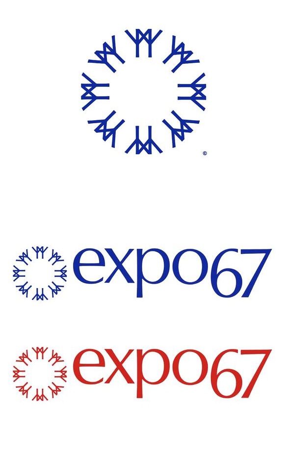
Expo 67: The Circle of Universal Friendship

The Logo: A circle made up of stylized human figures holding hands.
Created by: Julien Hébert, a renowned industrial designer from Québec.
Context: The 1967 World Exposition, held in Montréal, welcomed over 50 million visitors and featured more than 90 pavilions. It remains one of the most significant events of the 20th century in Canadian history.
Meaning: The logo expresses the ideal of friendship and cooperation among nations, perfectly aligned with the exposition’s theme, Man and His World. Each figure represents a person, and their circular arrangement symbolizes global unity.
Why it’s often confused: Its widespread use in 1967, along with its circular shape and abstract design, can make it difficult to distinguish from the Centennial logo, especially for those who didn’t live through that era.
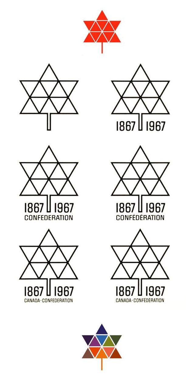
Canada’s Centennial: A Geometric Maple Leaf

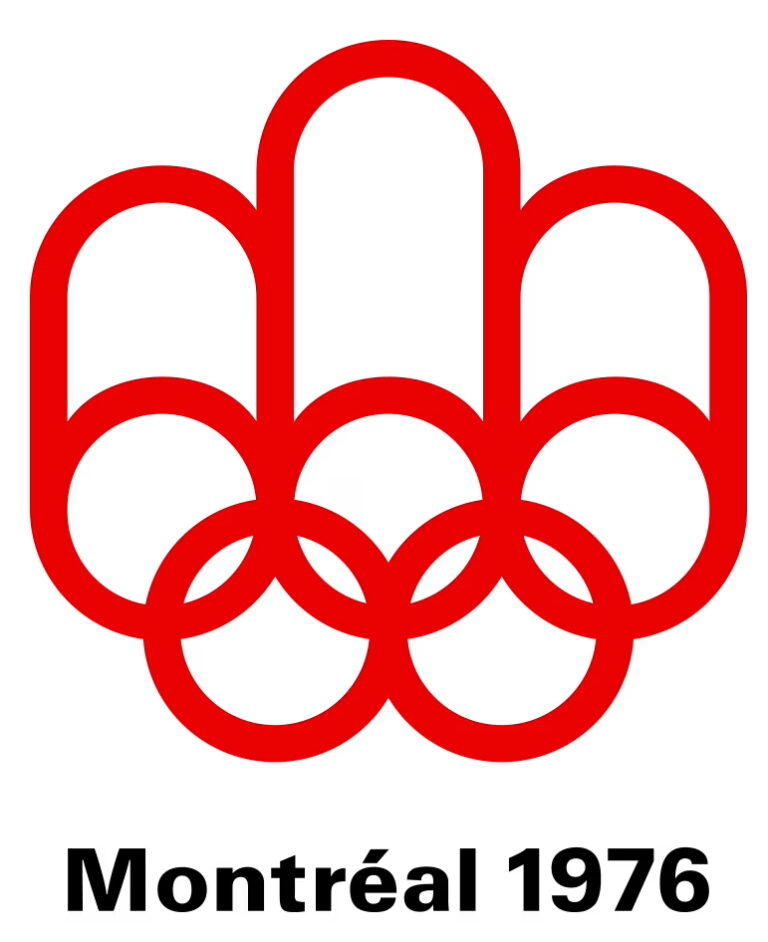
The Montréal Olympics: The Podium Shaped Like an M

The Logo: A stylized “M” that represents Montreal, an Olympic podium with three steps, and the five Olympic rings.
Created by: Georges Huel.
Context: In 1976, Montreal hosted the Summer Olympic Games. Less than a decade after Expo 67, the city was once again in the global spotlight.
Meaning: The logo is a graphic synthesis. It conveys the Olympic spirit, athletic achievement, and Montreal pride, all within a design deeply rooted in the aesthetics of the 1970s.
Why it’s often confused: Because Montréal is tied to both major events, Expo and the Olympics, that helped shape its international image. The visual language is also similar: clean lines, geometric forms, and a bold use of red.
